


Step 1:
 Instead of using an image for the background of this product, i felt i would stick to typical conventions of music magazines and paste photos onto a decorative background, providing a layered look. I used the shape tool and created different coloured rounded edged rectangles to be the base of my design. I decided to keep some parts of a white grey to keep things simplistic yet have bursts of colour within the centre of the design. I have continued with the use of the font "Jimthorpe" for the title of the page which clearly states that this will show the contents of the magazine.
 Step 2:
 Secondly i decided to make an editors note and image to accompany this along the top section of the page. This allows the reader to see the thought and time that's been put into creating the magazine, and that the editor is someone who could be similar to them in their personality and dress sense. By adding frames to the image in random directions, this added a more interesting look and links to how mismatched and edgy the style of music that the magazine is representing is. These frames were also all embossed in order to make them "pop" out from the page more. I also decided to add an image of the front cover as this is a typical music magazine convention. It also allows continuity and links both parts of the magazine together.
 Step 3:
 Next i added the images to the page. This included previously analysed secondary images of an indie band and a stage shot of a live performance. I placed these along the left hand side on angles to allow sufficient room for text alongside. As well as this i edited an image (shown below contents screenshot) by using the magnetic lasso tool to "cut" my model from the image. I had to use the eraser tool to remove the sections between the gaps in her arm also. I then "placed" this onto my contents page and dragged it and re-sized it into the bottom right hand corner before embossing and adding a shadow to make her stand out greatly from the rest of the page.
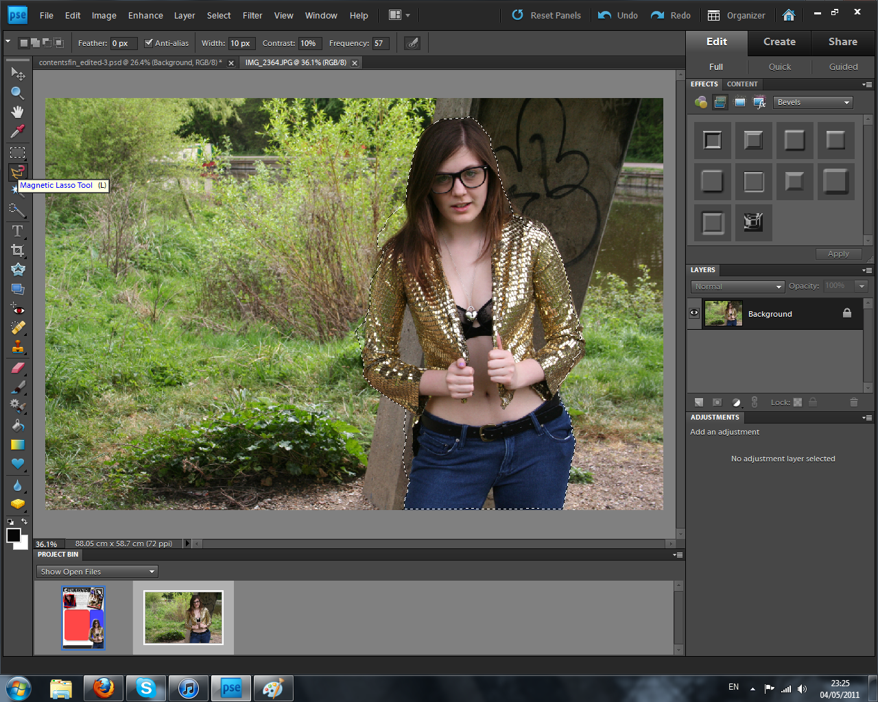
Step 4:
 After adding all the images, text needed to be added to describe all of the articles present within the magazine. I continued with the use of "payday" font to describe the articles and as well as adding taglines to each title for a little bit of extra information for the readers. The white fonts are easy to read above the coloured translucent shapes behind them and stick to my intended colour scheme. After adding the storyline, i placed arrows from those which had an image that linked with towards the photo it represented. This way the audience can instantly see the bands/situations that the articles will show. Finally i added the magazine's website along the bottom of the page as well as the date to self advertise and gain more viewers onto the domain.
 Step 5: Final Stage
 In the last stage i wanted to follow my initial sketch and add a banner to show savings for the reader. I did this simply by placing a rectangle outline box using the shape tool in the last free space on the page. I then filled this with text using the text tool. By using red this continued with the colour scheme and linked with a technique used within the retail industry in placing savings in the colour red. This is to make the audience think of christmas and the discounts and sales available at this time. Although this isn't used within the music industry, i felt this could be a clever way to influence my readers that saving money would be good for them. Of course, they can make their own minds up and this is an optional extra (linking to the use and gratifications theory).
No comments:
Post a Comment