Here are all of the photos i took during the four different photoshoots. I took many photos of my main model due to wanting the widest variety of photos. This also allows me to analyse the best shots in order to find the best images possible for creating my final products and essentially, a successful magazine.
Through all of the images, despite different costume changes, i kept the hair and makeup both natural in order to show the singer stripped back to her normal self and allow readers to gain a real insight into the person behind the fame.
I will now analyse some of my photos in reference to location, presenting both good and bad points.
Location 1: Open Field
In the midst of an open field, this allows the artist to be shown within a natural environment, portraying that the singer has been stripped down to the basics and her true self is being shown to the reader rather than the typical showbiz portrayal usually given. This innocent setting also reflects the style of music the singer is merging into, leaving the edgy rock scene and heading for something more fun and free.
This is a good image due to catching Anna mid-skip with a smile on her face, clearly showing she is enjoying what she is doing. The dark clothing contrasts well against the models pale skin, however this creates a more edgy atmosphere than the one i was aiming which was more electro inspired and fun. The background setting also unfortunately overpowers the model and takes the emphasis off her, this also disables the reader being able to see her expression clearly and feel as though they are getting "close" to the real her.
This is a powerful image due to the models stance being predominant in the foreground of the image whilst the scenery lays a calm backdrop behind. The way the model is running her fingers through her hair and exposing her upper body in an open pose produces confidence which can clearly be read by readers and inspire them to act the same. The strings hanging from the dress cause a problem, however this could be photoshopped out in the editing stage.

This high angle shot is interesting to look at, and shows the vulnerable side of the model, swapping roles and allowing the audience to be "above" her whilst usually in the fame business the celebrity is "above" their fans in social and wealth status. By giving this role reversal this can allow the readers to see that the artist is only human just like them and inspire them to want to buy the magazine and read more into the tale she has to tell. This shot could be improved by placing the whole of the models body into the frame rather than cutting off at her knees.
Here i placed Anna behind a steel gate and took the photo at eye level. This would cleverly link to how the artist is "breaking free" from the music genre she is associated with due her looking as though she wishes to escape from behind the bars. The vertical bar however cuts through half of the image and again the strings from the model's dress are hanging down. It could also look better if the models feet were in view.
Here the whole model is in the frame of the image and her "laid-back" pose allows the readers to feel comfortable in her presence. The setting isn't the most attractive looking and the post on the left hand side would need to be cut out. I would also have preferred my model to be smiling in this image to show how she is happy with what she's doing and to show the readers a positive ambience.
Although some of these photos are effective, i don't feel any are strong enough to take place in my final products. The grassy atmosphere doesn't reflect the electro vibe i thought it could do and there are many pieces i would need to edit in photoshop to create them to be useable.
-----------------------------------------------------------------------------------------------------------------------------------
Location 2: Under A Concrete Bridge
I felt as though this was the most appropriate location and therefore decided to take two sets of photos here with the model in different sets of clothing to provide two different styles of imagery. The concrete atmosphere allows a sophistication and provides a neutral backdrop, allowing the focus to be on the model. The use of concrete and graffiti also links to the underground scene of electro music, and the bright bold colours link to the style of the genre.
(Grey striped jumper and jeans outfit)
This image has a more urban feel and the casual clothes the model is wearing allows the reader to feel comfortable with the image. However the model looks uncomfortable in her pose and the bags in the bottom right hand corner provide a problem. The light from the reflections in the water also create this to be the main focal point rather than the model which isn't what i wanted to achieve.
This image is effective due to the concrete block being parallel to the model and creating an interesting shape, almost framing the image. The laid back pose the model is pulling shows a carefree attitude, a typical convention of music artists. The lighting is quite dark in this and doesn't highlight the model to stand out from the environment she is in.
I really like this photo as the lighting is warm and the graffiti on the walls is an interesting feature. The model looks relaxed and as though she has something to say for herself (which will be shown throughout the article). The clothing she is wearing mixes well with the concrete setting and the small bursts of green in the background add a splash of colour. I would increase the lighting on the models face and darken shadows if i were to use this photo in order to make it stand out more.
I feel these photos may be appropriate for my contents page due to the relaxed clothing and vibe the photos give off. The images are not of such an impressive "wow" factor that they could hold the presence of a front page or double page spread, but they could be used in the midst of other images in the contents.
-----------------------------------------------------------------------------------------------------------------------
(Gold glitter jacket and black bra top with jeans outfit)
I love this image, and it is the favourite of all the photos i took within the photoshoots. The model stands out immediately due to the clashing colours compared to the stoney background. The gold jacket reflects an electro style, along with the large "geek" glasses and oversized jewellery. The mise en scene is effective through the use of cobbled stones, portraying the more free and natural edgy underground atmosphere she is newly entering. I would darken the shadows within this photo to make the image "pop" even more.

This is another favourite of the images i took. The portrait style would be perfect for the front cover image, and the way in which again the gold jacket is present reflects indie electro, this time with purple nailvarnish showing to compliment this. The way in which the model places her arm across her middle shows she is still slightly defensive and worried about the new industry she is heading into, which allows the reader to subconsciously sympathise with her and want to know more about her story. The variety of concrete shapes behind her creates an interesting mise en scene and adds to the funky mis-match of her genre of music and fashion.

Here is a close up of the artists eyes which i thought could look effective due to this being a way to show the model interacting with reader. Anna is looking straight into the camera lense, behind a pair of glasses which could be seen as a "security blanket" for her, as if she is about to open up and share her true story despite not being entirely comfortable yet. The problem with this image is you can see myself in the lenses reflection taking the image which would be quite hard to edit out.
These are my favourite images and i will definitely use the first two within my final products. The gold jacket is a perfect reflection of the electro music style she plays for and the concrete background creates an interesting mise en scene. The natural lighting here worked perfectly, and with a few tweaks will create breath taking photos.
------------------------------------------------------------------------------------------------------------------------------------
Location 3: A secluded overgrown forest
At this location it allowed the bright blue shirt the model was wearing to stand out from the bright greens of the forest. The atmosphere also represented the way the model was trying to break out from the stereotype she had been placed in. Similarly to the field, the environment of nature shows how the singer has been brought back to simplicity and is showing her true self.
This is an effective shot with the models face being directly centered and her pale skin creating the main focal point. The blue shirt contrasts well against the bright greens, and these bright colours reflect the electro style of music well. I would want to darken Anna's hair to allows this to contrast even more against her skin, and create her to stand out against the background.

This photo is effective and allows the whole of the model's body to be in shot, showing the reader every inch and the "real deal". The way in which she is situated at the front of a long path connotes how she has been on a long journey to get to where she is now and can show the audience how much of a struggle being in the music industry really is. The fashion of entirely blue and black stands out greatly against the green and browns of the forest, whilst her pale skin reflects alongside the small patches of sky visible. I would need to edit the bags in the background of the image and perhaps darken the hair to contrast against the skin even more so.


The four images here shown to the right are all similar in background and show the different personality traits of the model. They have caught different moments and in a mood of where the model is just having fun and messing around, rather than seriously posing for the images. This reflects her new style of music and her new character she is revealing. These could be used effectively in a trail together and i am thinking of putting a polaroid effect on them to give a vintage feel in which modern day teenagers are interested in due to being able to find out about the past. Again the blue shirt contrasts well against the green backgrounds. The sheer material of the shirt allows skin to be shown which could be seen as "sexy" and appeal to both the male audience who find this attractive and the female audience will aspire to dress similarly due to it's high fashion element.
These images portray the singer in exactly the way i wanted,
wearing bright colours and enjoying what she is doing. These could be both effective within the contents page and double page spread due to their fun nature. The styling of the blue shirt will contrast well against the gold used in the previous photoshoot and will also link into my colour scheme, highlighting the blue used within fonts and banners.


 Instead of using an image for the background of this product, i felt i would stick to typical conventions of music magazines and paste photos onto a decorative background, providing a layered look. I used the shape tool and created different coloured rounded edged rectangles to be the base of my design. I decided to keep some parts of a white grey to keep things simplistic yet have bursts of colour within the centre of the design. I have continued with the use of the font "Jimthorpe" for the title of the page which clearly states that this will show the contents of the magazine.
  Secondly i decided to make an editors note and image to accompany this along the top section of the page. This allows the reader to see the thought and time that's been put into creating the magazine, and that the editor is someone who could be similar to them in their personality and dress sense. By adding frames to the image in random directions, this added a more interesting look and links to how mismatched and edgy the style of music that the magazine is representing is. These frames were also all embossed in order to make them "pop" out from the page more. I also decided to add an image of the front cover as this is a typical music magazine convention. It also allows continuity and links both parts of the magazine together.
  Next i added the images to the page. This included previously analysed secondary images of an indie band and a stage shot of a live performance. I placed these along the left hand side on angles to allow sufficient room for text alongside. As well as this i edited an image (shown below contents screenshot) by using the magnetic lasso tool to "cut" my model from the image. I had to use the eraser tool to remove the sections between the gaps in her arm also. I then "placed" this onto my contents page and dragged it and re-sized it into the bottom right hand corner before embossing and adding a shadow to make her stand out greatly from the rest of the page.
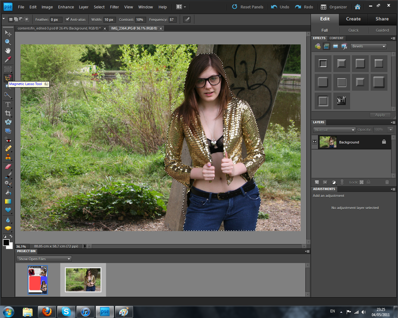
 After adding all the images, text needed to be added to describe all of the articles present within the magazine. I continued with the use of "payday" font to describe the articles and as well as adding taglines to each title for a little bit of extra information for the readers. The white fonts are easy to read above the coloured translucent shapes behind them and stick to my intended colour scheme. After adding the storyline, i placed arrows from those which had an image that linked with towards the photo it represented. This way the audience can instantly see the bands/situations that the articles will show. Finally i added the magazine's website along the bottom of the page as well as the date to self advertise and gain more viewers onto the domain.
  In the last stage i wanted to follow my initial sketch and add a banner to show savings for the reader. I did this simply by placing a rectangle outline box using the shape tool in the last free space on the page. I then filled this with text using the text tool. By using red this continued with the colour scheme and linked with a technique used within the retail industry in placing savings in the colour red. This is to make the audience think of christmas and the discounts and sales available at this time. Although this isn't used within the music industry, i felt this could be a clever way to influence my readers that saving money would be good for them. Of course, they can make their own minds up and this is an optional extra (linking to the use and gratifications theory).


