
About Me

- Sophie Dawn Stainton
- Waltham Cross, Hertfordshire, United Kingdom
- Hiya! I'm Sophie, an A Level Media student who has high hopes for the future! Oh, and i'm a tiny bit accident prone...
Monday, 9 May 2011
Sunday, 8 May 2011
Tuesday, 3 May 2011


Double Page Spread Construction


Firstly i opened up the original picture image that i felt would be ideal for my double page spread due to the smile on the models face, expressing happiness and confidence within herself as well as a large space on the right available for text and other images. The clothes the model is wearing suits her music genre (electro) perfectly, being eyecatching and colourful. The concrete background reflects the underground scene of which her music belongs to and the natural state in which she is showing herself for this interview.

Step 2:
In changing the lighting of the image i decided to firstly darken lots of the shadows and deeper colours within the image, including the conrete, the models hair, the gold jacket and blue jeans. This allowed the image to look more professional and stand out. After this i decided to use the lens flare tool which gave an effect on the entire image, creating a beam of light within the top left hand corner whilst photography smudges appear near the bottom right. This looks as though the image was a polaroid which has been developed and manipulated in a dark room, showing the readers that a lot of time and effort has been put into the article for their enjoyment. The lighting could also be drawn similarly to the way in which live gigs would be lit so the audience could see the bands clearly.

Next i decided to continue the theme of translucent shapes and keeping with the colour theme made two red banners which look as though they "frame" the entire spread. This looks effective and clever, adding a box-like style to the page which links in with the title "stepping out of the box". I also added a blue target banner in order to stand out which will be covered with the word exclusive to stand out. The arrow like end will also point towards the headline, drawing more attention to it. In order the balance the use of colours i then decided to use a simple white box background for the main interview text as this allows the main focus to be on the actual interview rather than the background behind it.I also embossed all of these shapes in order to give them a 3d effect and make them stand out from the background.
 Step 4:
I next wanted to add more images so that there was a variety on the page and i thought here would be relevant for the series of polaroid images i had previously planned. I created these images with a programme called "poladroid" in which you select an image (i used those from the overgrown forest shoot) and the software adds a polaroid style border instantly. After saving these i then "placed" these into my double page spread design and arranged them down the right hand side in an assortment. This allows many sides of the model to be shown and looks quirky with a vintage twist (linking to vintage inspiration behind indie music). I also added a text note from the artist to give a little personal message from the performer to the audience. This was using the text tool over a translucent shape.
 Step 5: Final Stage
Finally i added text, including titles, the interview and banners along the side and bottom of the spread. I continued with the use of "Jimthorpe" for the title and used the outline across the models hairline in order for the image to still be visible. The use of a quote along the bottom allows the readers to have a quick snippet of the actual interview and with the rebellious statement it should influence them to read the entire article.
Tuesday, 26 April 2011
Contents Page Construction

Step 1:
 Instead of using an image for the background of this product, i felt i would stick to typical conventions of music magazines and paste photos onto a decorative background, providing a layered look. I used the shape tool and created different coloured rounded edged rectangles to be the base of my design. I decided to keep some parts of a white grey to keep things simplistic yet have bursts of colour within the centre of the design. I have continued with the use of the font "Jimthorpe" for the title of the page which clearly states that this will show the contents of the magazine.
 Step 2:
 Secondly i decided to make an editors note and image to accompany this along the top section of the page. This allows the reader to see the thought and time that's been put into creating the magazine, and that the editor is someone who could be similar to them in their personality and dress sense. By adding frames to the image in random directions, this added a more interesting look and links to how mismatched and edgy the style of music that the magazine is representing is. These frames were also all embossed in order to make them "pop" out from the page more. I also decided to add an image of the front cover as this is a typical music magazine convention. It also allows continuity and links both parts of the magazine together.
 Step 3:
 Next i added the images to the page. This included previously analysed secondary images of an indie band and a stage shot of a live performance. I placed these along the left hand side on angles to allow sufficient room for text alongside. As well as this i edited an image (shown below contents screenshot) by using the magnetic lasso tool to "cut" my model from the image. I had to use the eraser tool to remove the sections between the gaps in her arm also. I then "placed" this onto my contents page and dragged it and re-sized it into the bottom right hand corner before embossing and adding a shadow to make her stand out greatly from the rest of the page.
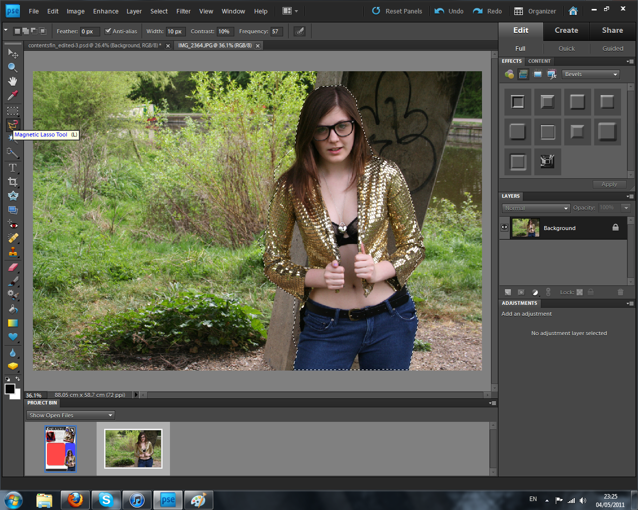
Step 4:
 After adding all the images, text needed to be added to describe all of the articles present within the magazine. I continued with the use of "payday" font to describe the articles and as well as adding taglines to each title for a little bit of extra information for the readers. The white fonts are easy to read above the coloured translucent shapes behind them and stick to my intended colour scheme. After adding the storyline, i placed arrows from those which had an image that linked with towards the photo it represented. This way the audience can instantly see the bands/situations that the articles will show. Finally i added the magazine's website along the bottom of the page as well as the date to self advertise and gain more viewers onto the domain.
 Step 5: Final Stage
 In the last stage i wanted to follow my initial sketch and add a banner to show savings for the reader. I did this simply by placing a rectangle outline box using the shape tool in the last free space on the page. I then filled this with text using the text tool. By using red this continued with the colour scheme and linked with a technique used within the retail industry in placing savings in the colour red. This is to make the audience think of christmas and the discounts and sales available at this time. Although this isn't used within the music industry, i felt this could be a clever way to influence my readers that saving money would be good for them. Of course, they can make their own minds up and this is an optional extra (linking to the use and gratifications theory).
 Monday, 25 April 2011
Front page construction

 Stage 1:
Firstly, i've opened the original picture as this will be the perfect background image for my cover. The model is looking directly at the camera lens and allows an interaction between the model and the reader. There is also sufficient space above the models head and across the hairline to place a headline which is the most typical convention of a music magazine front page.

I then decided to warm the lighting of the image by using the photo filter from a list of adjustment layers and used the warming filter. As well as this i wanted to darken the shadows, hair and black crop top of the model to made the image stand out more and contrast against her pale skin. I used the shadow tool for this, as well as the highlighter for small sections such as the models forearm and parts of the rocky concrete in the background.
After the photo lighting editing, i placed a text box of my chosen title across the top banner of the page. I decided to do this in order to stick to typical conventions that the audience would be comfortable with and that it would be easily seen when flicking through shelves in a store it would be purchased at. I used the font Jimthorpe, placing the first syllable of the word in block colour whilst the second in outline to create a more interesting looking headline.
 Stage 3:
 I next placed the translucent shapes that would be the backgrounds for each piece of text i would include on the page. These allow the text to stand out more from the imagery, but the translucent style of the shapes allows the background image to still be fully visible and not cut off any sections which would ruin the continuity. I kept with my intended colour theme of red, blue and white as these bursts of colour look attractive for the readers. To make the boxes stand out even more i used the emboss tool to raise their levels and look more 3d, as well as adding shadows to exaggerate this even more. I also added a barcode and price onto the page as this is a typical convention of magazine covers and will allow readers to see how much the product is (£2.50) in a subtle manner.
 Stage 4:
After making the background bases for the text i added all of the text boxes on the page. I again used the emboss tool to make some of them stand out more than others. These are in contrasting blues/reds and white fonts in order to stand out at different sections and cause variety. I again used the font "jimthorpe" as well as "monotype corsiva" and "pristina". By using these 3 it kept the design simplistic but still with variation and i feel as though the different fonts compliment one another. All of the texts advertise the different articles within the magazine or express about free gifts and how popular the product is, this gives the audience an insight into what they have if they purchase it which will encourage them to do so.
 Stage 5: Final Stage
I finally added secondary images to my cover which include the cd cover art accompanying the "free cd for every reader" pug along with "reader's" own photos taken at live music gigs. The cd art compliments the main image due to them being of the same artist whilst the live photos add a more edgy feel and allow the readers who took the photos to feel as though they had a major part to do with the production of the magazine.
Overall the front cover looks effective with the variety of fonts, colours and images. The most successful element was the use of translucent boxing behind fonts and i will continue to use this within the other products due it's appealing outcome.
------------------------------------------------------------------------------------------------------------------------------------
Making the CD Art:
Within the front cover i used a CD Art image which i created in photoshop. This shows the reader the art of the free cd they will receive after purchasing my product. The free gift allows the reader to feel as though they are gaining more for their money and that the magazine would be an essential item to them (linking to maslow's hierachy of needs)
 Stage 1:
Here i opened up an image i took from the "overgrown forest" photoshoot and i felt this would be appropriate for a cd cover shot due to the model looking straight into the camera lens making a connection with the reader, as well as the close up shot of the artists face being a typical convention of music cd covers.

I secondly warmed the image using filters and darkened shadows and highlighted the skin (similar to the process used for the front cover image). This allowed a more powerful image to be created in which the model stands out from the background immensely.

I then cropped the image using the crop tool in order to create the more stereotypical square box shape of a cd cover. After this i added two text boxes describing the artists name and the name of the album title in white font named "network vampires". This stands out well against the dark backgrounds and the simplicity of the design allows the audience to easily be able to understand it.

Lastly i added a black translucent bar down the left side of the album to keep continuity and add an extra element to the piece. This links in with the colour scheme and does not overpower the image yet creates a subtle backpiece.
Subscribe to:
Posts (Atom)